
AN ENCOURAGING UPDATE …
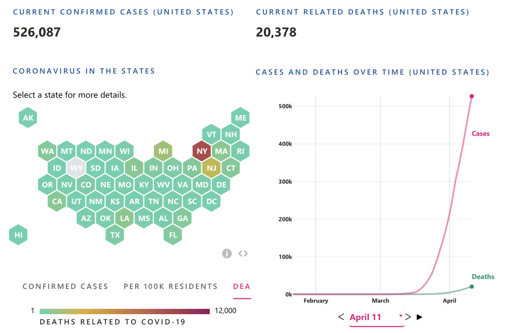
As of 11 April 2020, the current number of COVID-19 confirmed cases and related deaths in the U.S. are noted in the graphs below:
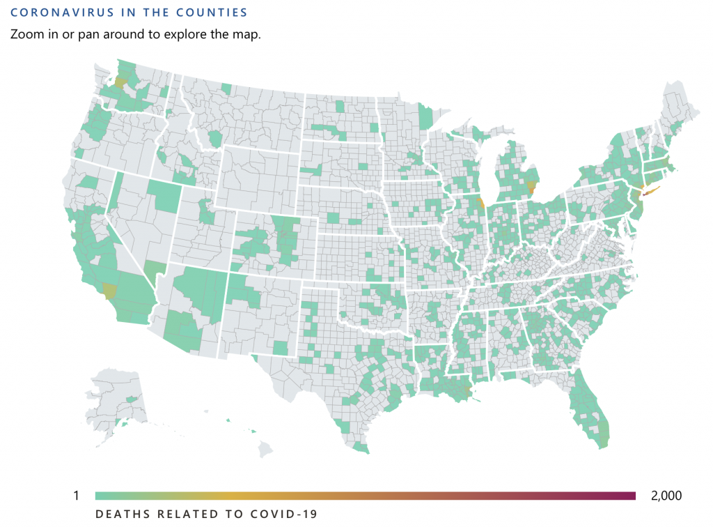
And here is a map of the U.S. showing all counties in which COVID-19 deaths are (or are not) occurring:
A few interesting facts and figures:
- There are a total of 3,144 counties in the U.S.
- Zero deaths have been recorded in the vast majority of those counties.
- There have been 10 or more COVID-19 related deaths in 207 counties, which account for 18,126 or 89% of total deaths.
- Those 207 counties represent 168,470,728 people or roughly one half (51%) of the total U.S. population.
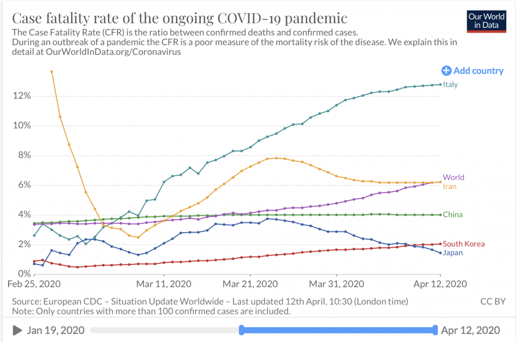
Let’s take a minute to discuss the morbidity or death or fatality rate.
Most rate data you see in the news today is what is referred to as Case Fatality Rate (CFR), as defined below:

However, it is very difficult to measure the denominator, as all symptomatic cases are not reported and most asymptomatic cases are not counted. Therefore, we prefer the more practical Crude Mortality Rate (CMR), which measures the probability that any individual in the population will die from the disease; not just those who are infected, or are confirmed as being infected. It’s calculated by dividing the number of deaths from the disease by the total population. For instance, if there were 10 deaths in a population of 1,000, the crude mortality rate would be [10 / 1,000], or 1%, even if only 100 people had been diagnosed with the disease.
The charts below display the CMR (or morbidity rate) for 50 – the 25 worst and 25 best – out of 207 U.S. counties with 10 or more recorded deaths attributable to COVID-19.
You won’t be surprised to see the states of NY, LA, GA and NJ in the 25 worst morbidity group and CA, TX and FL leading the 25 best morbidity group.
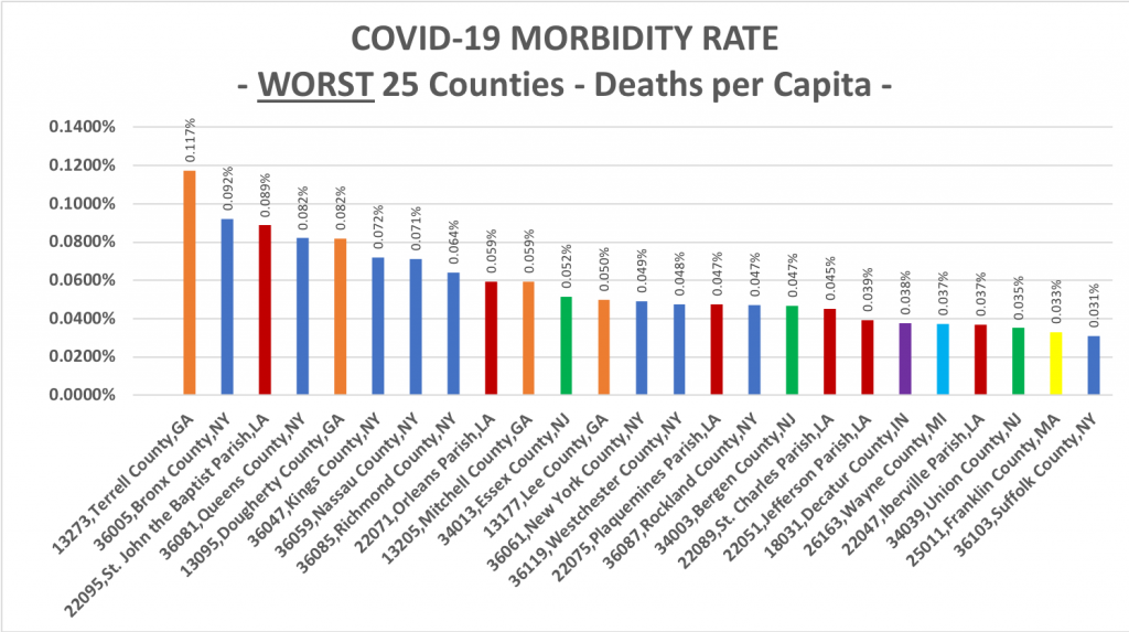
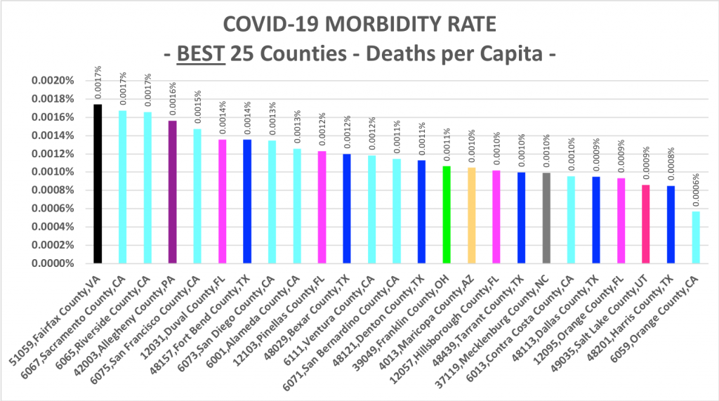
However, what should be reassuring to the average American, is that the CMR percentages (0.03% to 0.12%) in even the worst U.S. counties are much lower than the CFR rates reported by the main stream media and international health organizations (e.g., EDC) who are, in our opinion, simply scaring and panicking people.
Still, COVID-19 is a very infectious virus and can be deadly, especially it seems for the elderly with underlying health conditions. At least that’s what we’re being told by the “experts.” But we wanted to do some of our own research to see if we could find a correlation between the morbidity rates in our 25 worst and 25 best counties and some of the more popular variables being evaluated these days.
Specifically, we utilized the following county variables in our correlation analysis:
- population density (people per square mile)
- population percentage over 65-years-old
- population percentage of white people (non-Hispanic)
- population percentage of Black people
- population percentage in poverty
- quantity of households
- quantity of employer establishments
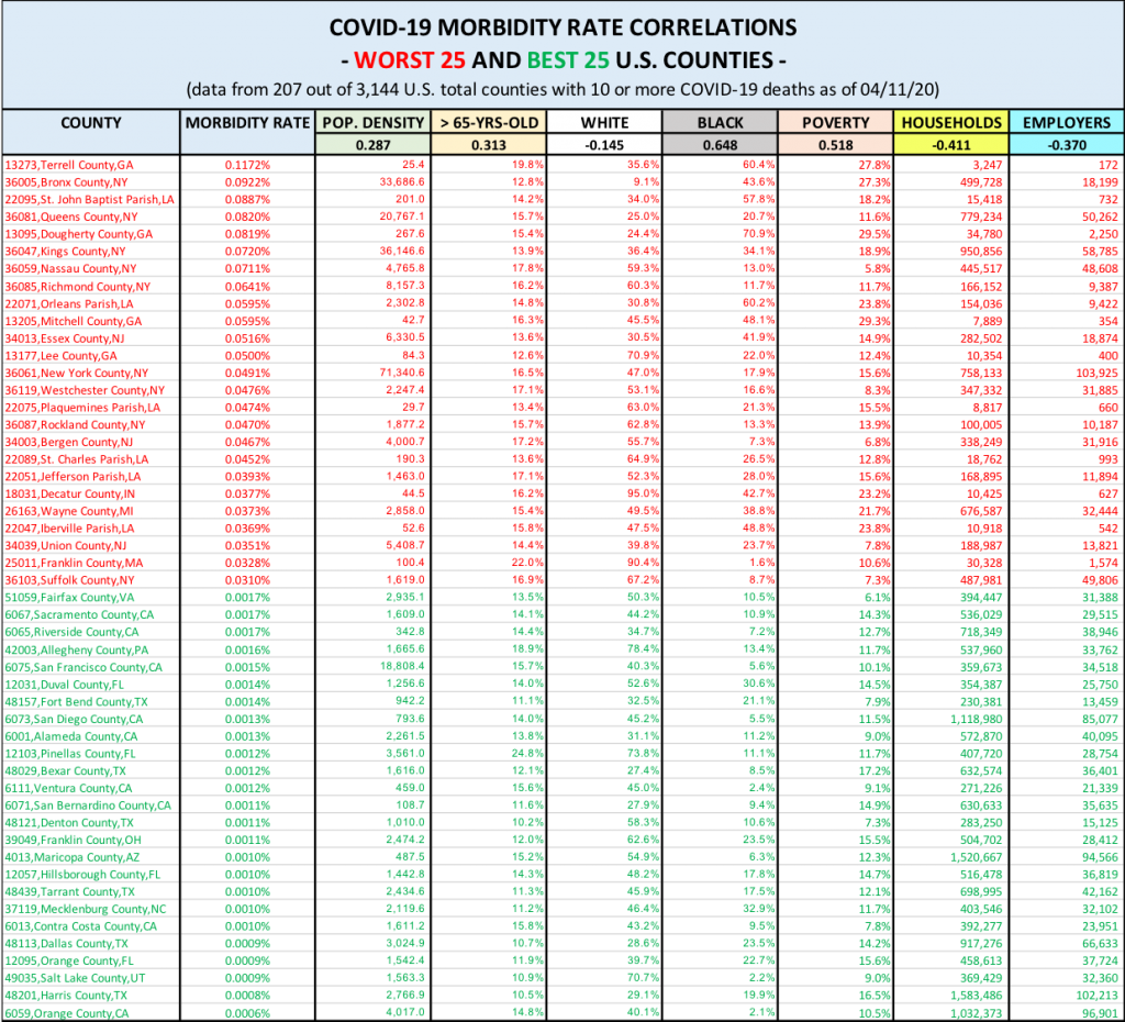
It may be a little difficult for you to find the correlation ratios, as they are in the boxes immediately below the variable headers. So here’s a brief summary of the correlation coefficients:
- Population Density: 0.287
- > 65-years-old: 0.313
- White: -0.145
- Black: 0.648
- Poverty: 0.518
- Households: -0.411
- Employers: -0.370
A quick reminder of how to read correlation coefficients:
The correlation coefficient is a statistical measure of the strength of the relationship between the relative movements of two variables. The values range between -1.0 and 1.0. A calculated number greater than 1.0 or less than -1.0 means that there was an error in the correlation measurement. A correlation of -1.0 shows a perfect negative correlation, while a correlation of 1.0 shows a perfect positive correlation. A correlation of 0.0 shows no linear relationship between the movement of the two variables. The strength of the relationship between variables varies in degree based on the value of the correlation coefficient. For example, a value of 0.2 shows there is a positive correlation between two variables, but it is weak and likely unimportant. Analysts in some fields of study do not consider correlations important until the value surpasses at least 0.8. However, a correlation coefficient with an absolute value of 0.9 or greater would represent a very strong relationship. (Source: Investopedia)
So what did we learn?
The strongest correlations with morbidity rates were the counties’ Black and poor populations. While these correlations are not super strong, they do indicate some truth to the belief that the Black population’s greater representation in urban environments and more prevalent underlying health conditions may make them more susceptible to dire consequences if they contract the virus. The economically poor population are generally in poorer medical condition and do not have as much access to quality health care, so this correlation makes sense as well. These most vulnerable parts of our population must be priority number one for our government and healthcare leaders.
Surprisingly, the popular theory that densely populated urban centers and areas with concentrated elderly populations are more likely to have higher morbidity rates does not appear to hold water, as we found very weak correlations. We would like to run a correlation with data on elderly populations possessing underlying respiratory health conditions but alas we have not yet found such data. We will keep looking.
Meanwhile, we urge you to continue following the government’s healthcare guidelines, but we hope our CMR data and correlation exercise give you some encouragement that the situation isn’t as dire for the vast majority of Americans as some would have you believe.